SWEET Demonstrator
The SWEET (Space Weather Exploration and Evaluation Technologies) demonstrator currently provides access to a rich dataset of pre-processed electron density observations based on the Neustrelitz Electron Density Model (NEDM) model and IMPC based calibrated slant total electron content (STEC) data assimilated into the model by using the 3DVAR approach. The current version of the demonstrator covers data (4D NEDM values and 3DVAR assimilations) for the whole year 2023 with a temporal resolution of 5 minutes and a spatial resolution of 2.5 degrees latitude by 5 degrees longitude. It enables a user to visualise and explore the whole data set including filtering and slicing through its dimensions with a very low latency in a common web browser.
Main Features
It provides two different use cases in terms of dashboards, which can be accessed by clicking on the relevant entries in the top level menu:
- Data Exploration, which provides maps and time series of the electron density, vertical electron content and peak electron density measurement based on selected time and location
- Satellite Analysis, which provides maps and time series of the electron density, vertical total electron content and the altitude along a satellite trajectory
Use case: Data Exploration
Motivation
The primary motivation behind the data exploration use case is to provide an interactive platform for users to delve into the 4D ionosphere and plasmasphere data. By allowing users to select their preferred time and region of interest, it enhances the accessibility and usability of this complex dataset. The incorporation of the solar activity data, specifically the F10.7 index, provides users with context related to solar influences on the ionosphere, aiding in their data exploration.
Features
Input selection
As shown in Figure 1 the key elements of the input selection are:
-
Calendar Date Selection: Users can interactively select the date they want to visualise. This feature provides flexibility for users to explore data from specific time periods, which is essential for various research purposes.
- Solar Activity Visualisation: The calendar selector includes a visualisation of the maximal observed solar radio flux index F10.7. This information helps users understand the solar activity during the selected time period. Gray cells indicate periods with no available data, which provides transparency regarding data availability.
- Data Source Selection: Users can choose between two data sources: NEDM (pre-processed electron density observations) and assimilated data based on the 3DVar approach. This selection allows users to compare and analyse data from different sources, catering to different research or analysis needs.
- Projection Selection: Users can choose between different map projections (Natural Earth, Equal Earth, Equirectangular, Interrupted Homolosine).
By combining these elements, the use case offers users a powerful tool to navigate and analyse 4D ionosphere and plasmasphere data. It ensures that users can make informed decisions about the data they choose to explore, considering both the data source and the context of solar activity.
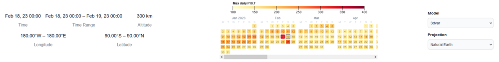
Figure 1: Input elements to select the data type, the time period and projection to be visualised.
Electron Density visualisation
As shown in Figure 3, based on the selected date a map of geographic map on the top left shows the global distribution of the electron density at a certain altitude (defaults to 60.000 km). Next to the map on the right a logarithmic altitude profile is shown. Below the map the time series of the electron density over the selected day and region is shown.
The map itself provides the following features:
-
Visualisation of Electron Density: The geographic map displays the global distribution of electron density at a specified altitude, with the default set to 60,000 km. Users can select a specific time and altitude level to visualise the electron density.
-
Solar Terminator: The map indicates the solar terminator, helping users identify day and night conditions concerning the geographic location. This feature provides essential context for understanding the electron density variations.
-
Geomagnetic Equator: The map also visualises the geomagnetic equator, which highlights a primary source of plasma movement. This feature is critical for users to understand the underlying dynamics of the ionosphere.
-
Region of Interest Selection: Users can select a region of interest on the map. This selection dynamically updates the interactive altitude profile plot and the time series plot based on the chosen region and time.
- Download Button: User can download the plotted data in JSON format.
The interactive plot of the time series of the electron density provides the following features:
-
Dynamic Updates: The altitude profile plot instantly and dynamically updates based on the selected time and region of interest, ensuring users have real-time insights into the data.
-
Electron Density Visualisation: The altitude profile plot displays the electron density height profile as a solid black line. It also highlights the minimum and maximum bounds with a gray shaded area around the profile.
-
Detailed Values Display: Users can hover over the plot to view detailed values, enhancing their ability to analyse and interpret the data effectively.
-
Peak Height (hmF2): The plot includes the visualisation of the peak height (hmF2) with a dashed red line.
-
Altitude Level Selection: Users can select the altitude level by moving a black dashed line on the plot, allowing for focused analysis at different altitudes.
- Download Button: User can download the plotted data in JSON format.
The interactive plot of the altitude profile provides the following features:
-
Dynamic Updates: Similar to the altitude profile, the time series plot instantly and dynamically updates based on the selected time and region of interest.
-
Electron Density Time Series: The time series plot displays the electron density over the selected day and region, represented by a solid black line. It also shows the minimum and maximum bounds with a gray shaded area around the line plot.
-
Detailed Values Display: Users can obtain detailed values by hovering over the plot, facilitating in-depth data exploration.
-
Pan and Zoom: Users can interactively pan and zoom within the time series plot, allowing them to change the time period of interest as needed.
- Download Button: User can download the plotted data in JSON format.
It's important to note that the elements within this visualisation are highly interconnected. Changes in one parameter, such as time in the time series plot or the region of interest in the map, lead to updates in relevant elements, ensuring a cohesive and interactive experience for users.
This comprehensive visualisation provides users with the tools they need to explore and analyse electron density data effectively, considering various parameters and visual aids that aid in data interpretation.
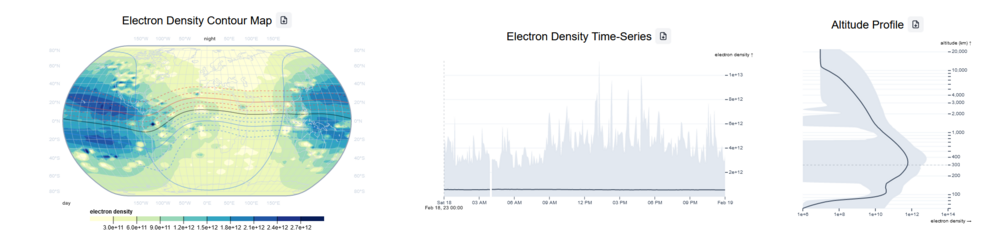
Figure 2: Accordion providing the interactive exploration of the electron density data.
Vertical Total Electron Content visualisation
As shown in Figure 4, based on the selected date a map of geographic map on the top left shows the global distribution of the vertical total electron content (VTEC) at a certain altitude (defaults to 60.000 km). Below the map the time series of the VTEC over the selected day and region is shown.
The map itself provides the following features:
-
Visualisation of VTEC: The geographic map displays the global distribution of Vertical Total Electron Content at a specified altitude, with the default set to 60,000 km. Users can select a specific time and altitude level to visualise the VTEC data.
-
Solar Terminator: The map indicates the solar terminator, helping users identify day and night conditions concerning the geographic location. This information is crucial for understanding variations in VTEC due to solar influences.
-
Geomagnetic Equator: The map also visualises the geomagnetic equator, highlighting the primary source of plasma movement. Understanding the geomagnetic equator is essential for interpreting VTEC data accurately.
-
Region of Interest Selection: Users can select a region of interest on the map. This selection dynamically updates the interactive time series plot below the map based on the chosen region and time.
- Download Button: User can download the plotted data in JSON format.
The interactive plot of the time series of the vertical total electron content provides the following features:
-
Dynamic Updates: The time series plot instantly and dynamically updates based on the selected time and region of interest, ensuring real-time insights into VTEC data.
-
VTEC Time Series: The time series plot displays the vertical total electron content over the selected day and region, represented by a solid black line. It also shows the minimum and maximum bounds with a gray shaded area around the line plot.
-
Detailed Values Display: Users can obtain detailed values by hovering over the plot, facilitating in-depth data exploration.
-
Pan and Zoom: Users can interactively pan and zoom within the time series plot, allowing them to change the time period of interest.
- Download Button: User can download the plotted data in JSON format.
Similar to the Electron Density Visualisation, the elements within this VTEC Visualisation are highly interconnected. Changes in parameters such as time in the time series plot or the region of interest in the map lead to updates in relevant elements, ensuring a cohesive and interactive experience for users.
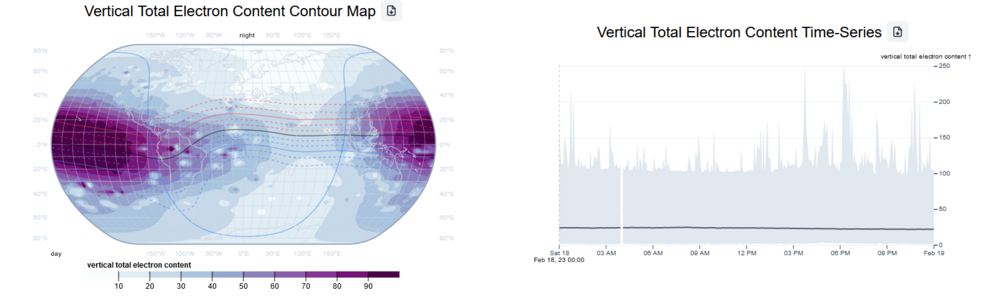
Figure 3: Accordion providing the interactive exploration of the vertical total electron density data.
Peak electron density visualisation
As shown in Figure 5, based on the selected date a map of geographic map on the top left shows the global distribution of the peak electron density at a certain altitude (defaults to 60.000km). Below the map the time series of the peak electron density over the selected day and region is shown.
The map itself provides the following features:
-
Visualisation of Peak Electron Density: The geographic map displays the global distribution of peak electron density at a specified altitude, with the default set to 60,000 km. Users can select a specific time and altitude level to visualise the peak electron density data.
-
Solar Terminator: The map indicates the solar terminator, helping users identify day and night conditions concerning the geographic location. Understanding these conditions is crucial for interpreting variations in peak electron density due to solar influences.
-
Geomagnetic Equator: The map also visualises the geomagnetic equator, highlighting the primary source of plasma movement. Understanding the geomagnetic equator is essential for interpreting variations in peak electron density.
-
Region of Interest Selection: Users can select a region of interest on the map. This selection dynamically updates the interactive time series plot below the map based on the chosen region and time.
- Download Button: User can download the plotted data in JSON format.
The interactive plot of the time series of peak electron density provides the following features:
-
Dynamic Updates: The time series plot instantly and dynamically updates based on the selected time and region of interest, ensuring real-time insights into peak electron density data.
-
Peak Electron Density Time Series: The time series plot displays the peak electron density over the selected day and region, represented by a solid black line. It also shows the minimum and maximum bounds with a gray shaded area around the line plot.
-
Detailed Values Display: Users can obtain detailed values by hovering over the plot, facilitating in-depth data exploration.
-
Pan and Zoom: Users can interactively pan and zoom within the time series plot, allowing them to change the time period of interest.
- Download Button: User can download the plotted data in JSON format.
The elements within this Peak Electron Density Visualisation are highly interconnected, similar to the previous visualisations. Changes in parameters such as time in the time series plot or the region of interest in the map lead to updates in relevant elements, ensuring a cohesive and interactive experience for users.
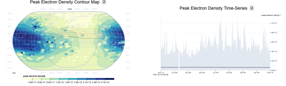
Figure 4: Accordion providing the interactive exploration of the peak electron density data.
Use case: Satellite Analysis
Motivation
The basic idea of this dashboard is to interactively explore the 4D ionosphere plasmasphere data by using the trajectories of a satellite moving through the ionosphere plasmasphere system as a data selector. The trigger could be an anomalous orbit event observed due to possible space weather activity (e.g. loss of satellites due to drag effects).
Features
As shown in Figure 6 one of the main input elements are:
- Calendar Date Selection: An interactive calendar feature empowers users to select specific dates, providing flexibility to investigate data aligned with satellite positions over time.
- Data Source (Model) Selection: Users can choose between two data sources, the Neustrelitz electron density model (NEDM) results or assimilated data based on the 3DVar approach. This selection enables users to analyse the chosen data source's impact on satellite trajectories and space weather effects.
- Projection Selection: Users can choose between different map projections (Natural Earth, Equal Earth, Equirectangular, Interrupted Homolosine).
- Satellite Selection: Users can choose a relevant satellite by name.
As shown in Figure 6, the map on the dashboard displays the global distribution of electron density at the orbit of the selected satellite. This data is calculated based on the Keplerian orbit elements provided by Two Line Elements (TLEs) files and the given time. The map provides an immediate visual context for the satellite's position relative to the ionosphere and plasmasphere.
The three stacked time series plots below the map visualise the electron density, vertical electron content, and altitude of the selected satellite over the chosen day. This dynamic representation enables users to track and analyse how these parameters vary in real-time as the satellite traverses the ionospheric environment.
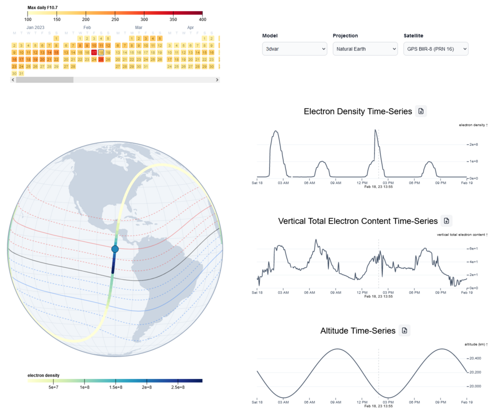
Figure 5: Satellite analysis dashboard showing the electron density, VTEC and altitude of the selected satellite and time.
A key strength of the Satellite Analysis dashboard is its ability to synchronise elements. Changes in the selected time parameter within the time series plots instantly update relevant elements on the map, such as the solar terminator, ensuring real-time solar position context. Similarly, a change in the region of interest on the map dynamically updates the time series plots, providing a coherent and intuitive user experience.
Essentially, the Satellite Analysis dashboard provides researchers, analysts and decision makers with a powerful tool for analysing the intricacies of space weather and its impact on satellite orbits. By providing a visual and data-driven approach to understanding satellite trajectories in the context of the ionosphere and plasmasphere, this dashboard plays a vital role in providing critical insights for a wide range of applications, from space weather monitoring to satellite operations and beyond.